We've given the Statusentry app a fresh new look: cleaner typography, a calmer color palette and more consistent components on every screen. We built it together with an AI assistant, and the experience changed how we think about our work. Here's what's new, how we did it, and what we learned.
What's new in the interface
Clean, readable typography
The whole app now uses Inter, a typeface designed for screens. Headings, labels, forms and tables share one consistent type scale, so information is easy to scan — whether you're setting up a service or posting an update in the middle of an incident.
A calm, focused color palette
Text, backgrounds and borders use a soft neutral palette, with a single indigo accent for links, toggles and focus states. Status colors are reserved for what matters: green for healthy, amber for warnings and red for failures, so a problem stands out at a glance.
Consistent components everywhere
Buttons, inputs, dropdowns, menus, cards, tables, labels and dialogs now follow the same rules: gently rounded corners, subtle shadows and clear hover, focus and disabled states. Primary actions are easy to spot, and keyboard users get a visible focus ring on every control.
Polished public status pages
The pages your customers see got the same care: clearer service groups, refined uptime bars and incident history that's easier to read.
How we built it: tokens first, then a theme
Instead of rebuilding screens one by one, we worked from a small set of design decisions and applied them everywhere:
- Design tokens. One file defines the visual language — fonts, colors, corner radii, shadows and focus styles.
- A global theme layer. A single stylesheet applies those tokens to every component in the app, so a change in one place shows up consistently on every screen.
- Focused polish. We then fine-tuned the screens people use most: navigation, incident pages and the public status page.
Because the structure and behavior of the app stayed the same, everything you're used to works exactly as before. Only the look changed, and it shipped in a single pull request.
What working with AI looked like
The AI didn't design the app on its own. It worked like a fast, tireless pair partner who knows CSS and our framework inside out:
- We described the goal in plain words: “clean, light and calm — readable at 2 a.m. during an incident.”
- The assistant proposed design tokens and a strategy, then wrote the theme, covering the many hover, focus, active and disabled states that are easy to miss by hand.
- We reviewed every screen in the browser and gave feedback — a shadow a little lighter, a label a little stronger, two status colors further apart — and it adjusted in minutes.
- We made the decisions. The accent color, the density of tables and what “calm” means for an incident tool were our calls.
How AI is changing the way we work
The redesign is one example of a broader shift. In the 2025 Stack Overflow Developer Survey, 84% of developers said they use or plan to use AI tools. For a small team like ours, the effect is bigger than “writing code faster.”
The cost of trying things has collapsed
When a new look, a prototype or a refactor takes hours instead of weeks, you try more options and keep the best one. We now explore two or three directions before choosing one.
Roles are blurring — in a good way
Engineers make credible design improvements, and product ideas turn into working prototypes the same day. We also rebuilt our marketing website, statusentry.com, as a more modern website with AI help.
Small teams can ship like big ones
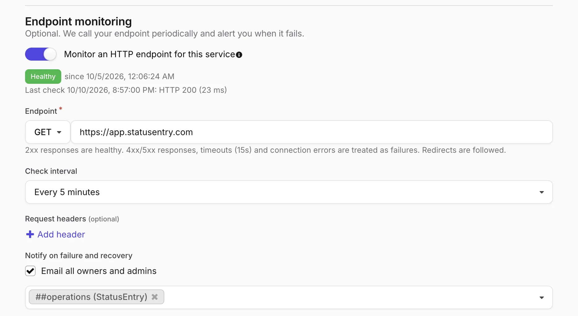
This year alone we shipped built-in endpoint monitoring, an AI writing assistant for status updates, server-rendered status pages and this redesign. AI didn't replace anyone on the team; it removed a lot of the slow, repetitive work between an idea and a release.
Judgment matters more, not less
AI makes it easy to produce something that looks finished. Deciding whether it's right — for our customers, at the worst moment of their day — is still human work. Reviewing, testing and saying “no, not like that” are now some of the most valuable things we do.
Speed raises the bar for communication
Shipping faster also means more change and more chances for something to go wrong. That's why we think clear incident communication matters more in the AI era, not less — we wrote about it in AI made shipping faster. Incidents still need a human voice.
What's next
The new interface is live for every Statusentry account. If something looks off, or you have ideas for what we should improve next, we'd love to hear from you at support@statusentry.com. Not a customer yet? Create a free account and see the new design for yourself, or open our demo status page.